verbal/visual, written, verbal/visual…
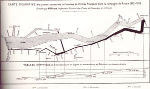
The graphic above (courtesy of my friend Keith Brunton) is considered by some to be possibly the best statistical graphic ever drawn. By Charles Joseph Minard (1781 – 1870), a French engineer, it shows the terrible fate of Napoleon’s army in Russia. Quoting from “The Visual Display of Quantitative Information” by Edward R. Tufte: “Described by E. J. Marey as seeming to defy the pen of the historian by its brutal eloquence, this combination of …