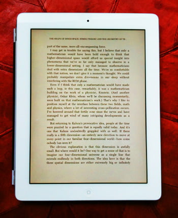
ebooks – a superior aesthetic?

Let me whisper to you a heresy: ebooks may be aesthetically superior to paper books. There, I’ve said it. Before they come for me, to burn me as a witch, let me try to explain what I mean.
First I would like to distinguish two different functional components of the paper book: the paper book as machine and the paper book as a (complex) surface that bears text. Though it is the latter that concerns me most here, I will say the following about the former:
Ebook reading devices can not only emulate many of the page turning, indexing, book marking etc functions of the paper book, but, by being programmable, can provide us with new facilities: ebooks can be searched, linked to other texts (or images, sounds, video etc), typographically modified (to use different fonts, or to use different sized fonts – thus tailoring the reading experience to the reader), and can come to possess any number of other features thought of or unthought of to date. These ergonomic issues are, of course, aesthetic in their own right, as are the actual physical characteristics of the paper book. This latter point seems to come up time and time again especially in the context of the ‘feel and smell’ of inked paper. I am the last person to dismiss this preference. However, not only is it possible that ebook devices will come to emulate – if the desire for this should continue – the ‘feel’ and ‘look’ of paper, but I would suggest that the ebook can bring its own feel and look to the reading experience; the slickness of metal and glass and all manner of textured plastics, and who knows what other materials. These particular aesthetic aspects of physicality will, no doubt, long continue to be a bone of contention – at least for those of us who have grown up with paper books.
Setting aside these considerations, I would like to turn to the second of my functional components: the book as a surface that bears text. This surface in paper books (and in scrolls, tablets and other devices that preceded the codex) is, after all, the one that most matters; it is that through which we actually ‘read’ the book. I would suggest that it is this surface that constitutes the primary aesthetic of any book (second only to its content). In the West (and I believe this carries through to other orthographies, printed or otherwise) the locus of this aesthetic lies in the laying out on the surface of crisp black characters in lines and in paragraph blocks, culminating in a macro-block, consisting of these components, that forms a ‘page’. It is thus the page that is central (everything else is merely a means of moving from one page to another). And it seems to me that there are two aesthetics that dominate the page: the quality of the print and the orthogonality of all the elements on a page.
Print by its very nature privileges repetition over individual uniqueness. For centuries scribes struggled manually to make each example of a given character identical to every other. With the advent of printing this became just about possible. I believe that the ebook represents the culmination of this process… for even printed books suffer from variations in ink density across a page and, because paper is an organic substrate, the kerning between printed characters can vary. Ebooks, by contrast, supply us with text that is of a perfectly uniform density and with precise, invariable kerning.
Similarly, the orthogonality of the macro-block of text on an ebook page is also invariable, whereas its paper counterpart is not. However, there is, I feel, a more important difference in the orthogonality (the perils of orthogonality are another matter: refer to “orthogonality” tag) of the macro-block: the gutter of a paper book. We are so accustomed to this that we hardly notice it, however, it is for many of us a cause of some irritation. It seems to me that, with all the advantages gained in the move from scroll to codex, there came also a major disadvantage: the gutter that was introduced by the need to attach the pages to the spine. Of course, in expensive books, hardcover rather than paperback (or even worse, those that are perfect bound), the way a page slopes down into a gutter is somewhat ameliorated – not only because the superior binding allows the book to lie flatter when open, but also because the macro-block is often kept away from the gutter by a wider margin. Paperbacks are altogether a different matter, with sometimes a reader being forced to peer down into the gutter into which the text seems to be slipping. In this sort of book the reader almost has to pull it apart to read it; perfect bound books literally come apart, so that the cover ends up as a folder holding a sheaf of loose pages.
The reader of an ebook is spared all of these misfortunes. Each page is presented perfectly flat and square and with no danger of being lost or of any damage coming to the device from the attempt to read what it displays.
So – I’ve not got long now before they come for me – though ebooks may be extremely disruptive to us readers, and though some things may be lost, I feel that, on balance, ebooks are destined to provide us with an aesthetically (never mind functionally) superior reading experience…